

Take a look at your landing page – can you objectively say that all the elements necessary to make your page attractive, engaging, and effective are in place?
If you’re not exactly sure what they are, keep reading. This article will help break down the different components that define an effective landing page and give you tips on how to use your landing page builder to make each one more compelling.
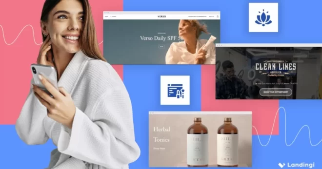
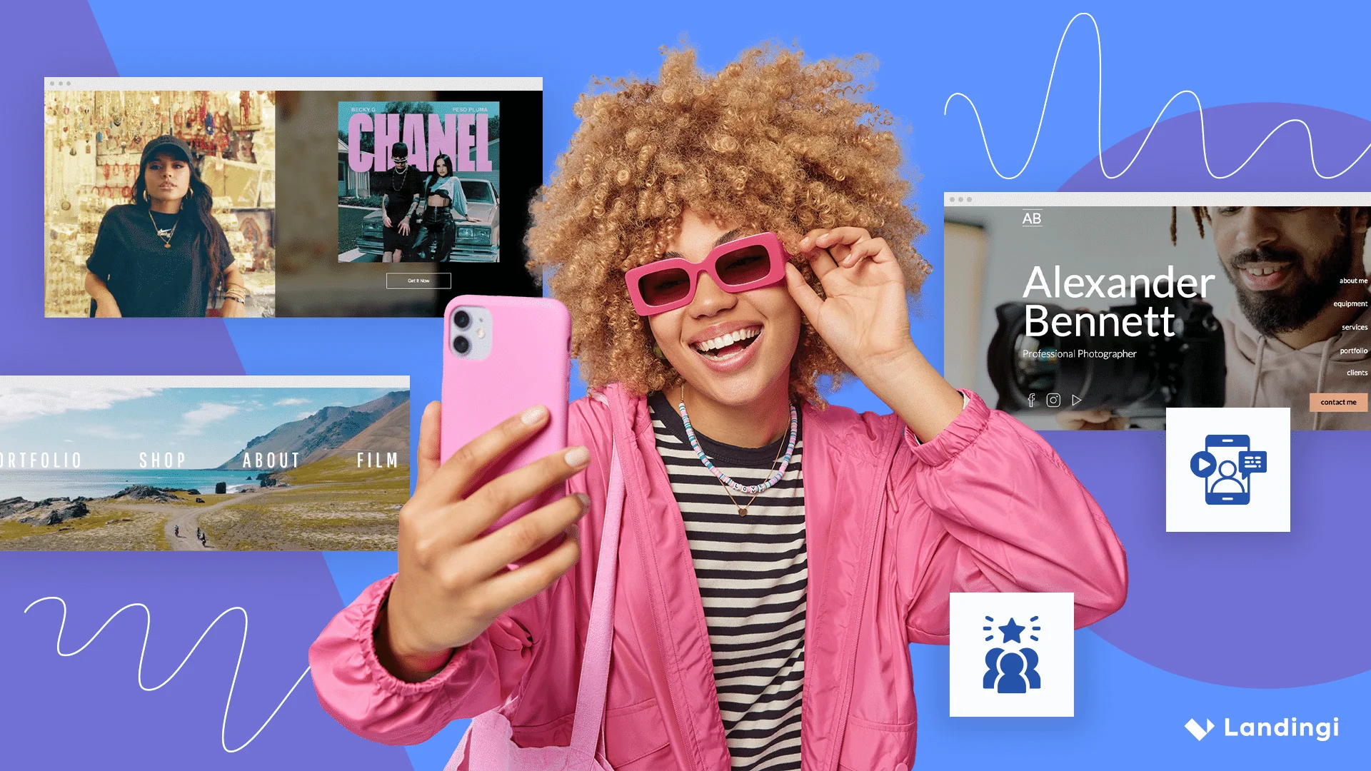
1. Visuals
As far as visuals are concerned, the overall layout of your landing page factors a great deal into how well it will convert visitors.
Generally, everything about your landing page should be simple, straightforward, and streamlined. Focus on your Call-to-Action (CTA) and get visitors to act on it so your objective is achieved. This requires you to streamline each and every section of your landing page.
You can do it yourself from scratch, but that’s not the only option. There are plenty of landing page templates to choose from. Just make sure the template contains the elements that fit the goal you want to achieve.
For example, if the landing page features a navigation bar, ask yourself if it’s absolutely necessary and what purpose does it really serve. If it’s not something that brings attention to your landing page, it will just distract your visitors from your CTA. In terms of copy, things such as your company vision and mission, your brand’s history, or anything similar are generally ineffective to move people down your funnel.
2. Headline
The importance of headlines for any kind of content being developed has been consistently discussed. Furthermore, headlines are even more relevant for your landing pages.
Remember, landing pages only have a few seconds to capture the interest of the visitor. The headline is likely the first thing that will hook them in and move them further down the conversion funnel.
If that seems like a daunting challenge, here’s another fact that you should take note of: visitors who end up on your landing page are already there because they are interested in what you have to say. An effective action on your part has already led them to your landing page. It’s now your main objective to convince visitors that they not only arrived at the right place but also have a compelling reason to stay.
In terms of language, you want to be clear and explanatory. Get to the point. You don’t want to give visitors time to wonder if they arrived at the right page or to question why they should be there. As for design, your headline should stand out even more than your company logo or site name.
3. Offer
Your offer, quite simply, is anything that you’re giving in exchange for getting your visitors to do what you want. This can be in the form of coupons or discounts, as well as free trials, free ebooks, or access to exclusive whitepapers.
An effective offer helps usher your visitors further into your conversion funnel. To add a sense of urgency, add a deadline for your offer. For example, instead of saying, “Download free ebook now,” try “Download your free ebook in the next hour.”
Be sure to communicate your offer in the simplest way possible to avoid confusing visitors.
4. Call-to-Action
There’s no use designing beautiful WordPress landing pages if you do not include any Call To Action on them.
Your CTA is the specific action you want your visitors to take. There are a variety of options including download now, sign up, get in touch, watch our video, etc.
Whatever option you choose, this is where you should be the most persuasive, engaging, and brief. Avoid inundating your visitors with multiple instructions. Create a single CTA with a specific and clear request.
The only way to determine which CTA actually works best is by testing it, which is easy to do.
CTAs have specific elements that you can easily assess such as size, color, font, copy, and placement. There are a few design considerations that have been known to deliver results. For example, make sure your CTA button actually looks like a button and is displayed in a color that contrasts sharply with the rest of the page. This helps draw your visitor’s eye to it. Visual cues, like arrows, serve to draw attention to your CTA as well.
5. Social Proof
When it comes to implementing social proof on your landing page, take your cue from human behavior. People will usually place value on things that others have already approved of.
Online, the technique is just as effective. Social proof helps validate a visitor’s decision, or at the very least, demonstrates the fact that they are about to make a good one by clicking on your CTA.
The addition of logos of your biggest customers quotes from major press mentions, usage statistics, and customer testimonials on your landing page provide social proof. Understandably, if your business is fairly new, you may not have a lot of recognition. So, take the time to assemble them early on.
If you’re fortunate enough to have a lot to share, this is where you should exercise some restraint. These elements, while bolstering your credibility, can make your landing page look cluttered.
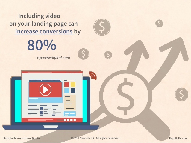
6. Media
In the interest of keeping landing pages clutter-free, you might opt to forego using videos or images on your landing page. However, when used thoughtfully, they can be very effective.
Images, for example, can help move your visitor’s eyes down the page towards the CTA. Videos can also be used to explain more about your business without adding content clutter to your page. In fact, using videos on a landing page will increase your conversions by as much as 80 percent.
Be sure to test whether your visitors will best respond to autoplay or press play videos. Normally, visitors should have the option to click on a video before it plays so that their user experience is not interrupted. If not, this might prompt them to just bounce off your landing page.
The basic elements of a landing page remain constant. However, effectively implementing each one requires thoughtful consideration and application so that they can actually lead to conversions.